
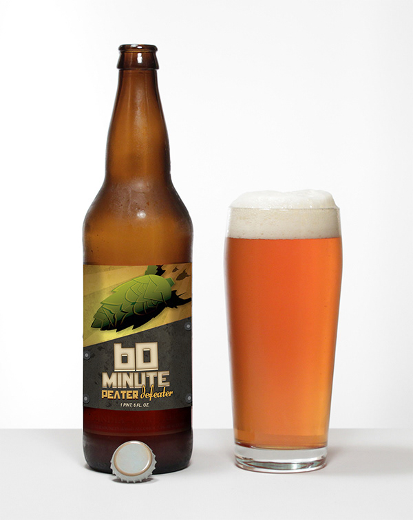
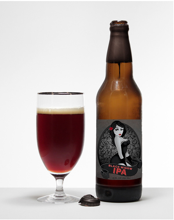
Proj. 1
Beer Labels
Beer Labels
Position | Double Canyons Brewery–Freelance Designer
Overview | Illustrated two IPA labels for a local up-and-coming brewery, blending WWII-era visual themes with a modern craft beer aesthetic. Inspired by pinup girl illustrations and wartime propaganda, the concepts brought historical flair and playful energy to the branding, giving each label a bold identity and strong shelf appeal.
Role | Consult, Conceptualize, Design, Lead Proof Reviews, Preflight, and Send to Production
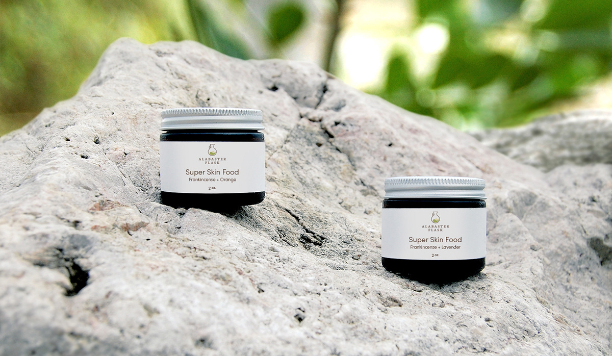

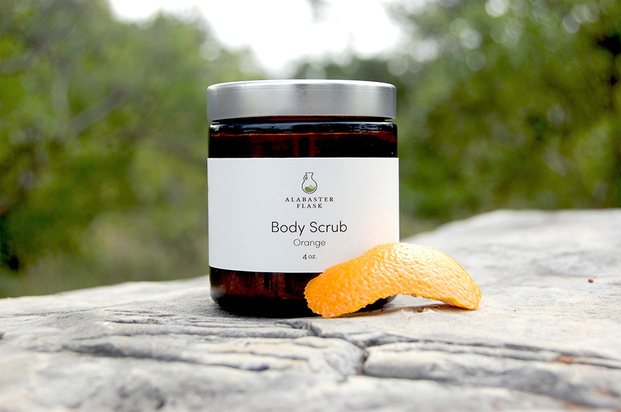
Proj. 2
Jar Labels
Jar Labels
Position |: Alabaster Flask–Creative Director/Designer
Overview | Designed a series of product labels for Alabaster Flask that reflect the brand’s core values of clean, natural, minimal, and pure. Each label was thoughtfully crafted to align with the aesthetic of the product line by using subtle design elements, restrained color palettes, and clear typography to create a cohesive and elevated visual identity across the brand.
Role | Consult, Conceptualize, Design, Lead Proof Reviews, and Preflight
Proj. 3
Promo Labels
Promo Labels
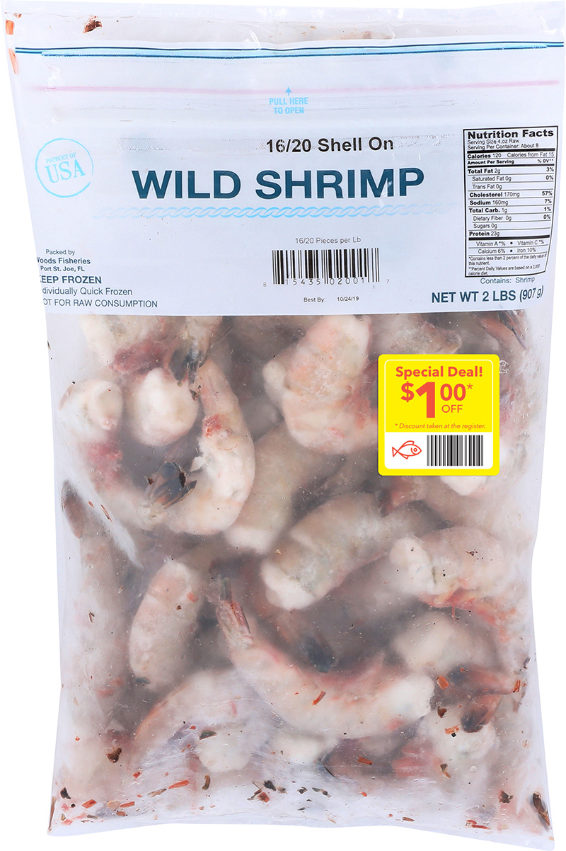
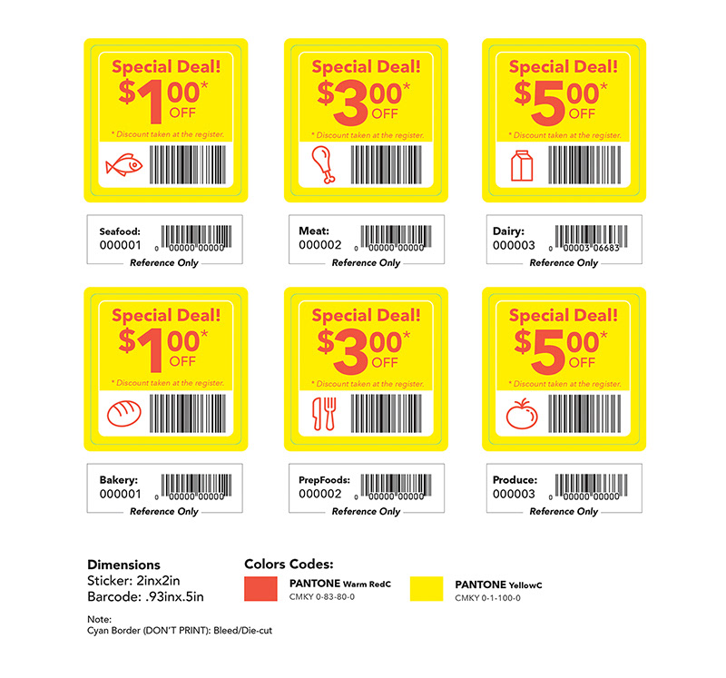
Position | WFM 365–Graphic Designer Lead
Overview | Tasked with improving communication around department specific markdown deals, I created sale tags for 365 by Whole Foods Market that help customers easily identify discounted items and assist team members in processing sales smoothly at checkout.
Role | Consult, Conceptualize, Design, Lead Proof Reviews, Preflight, and Send to Production
Proj. 4
Bottle Table
Bottle Table
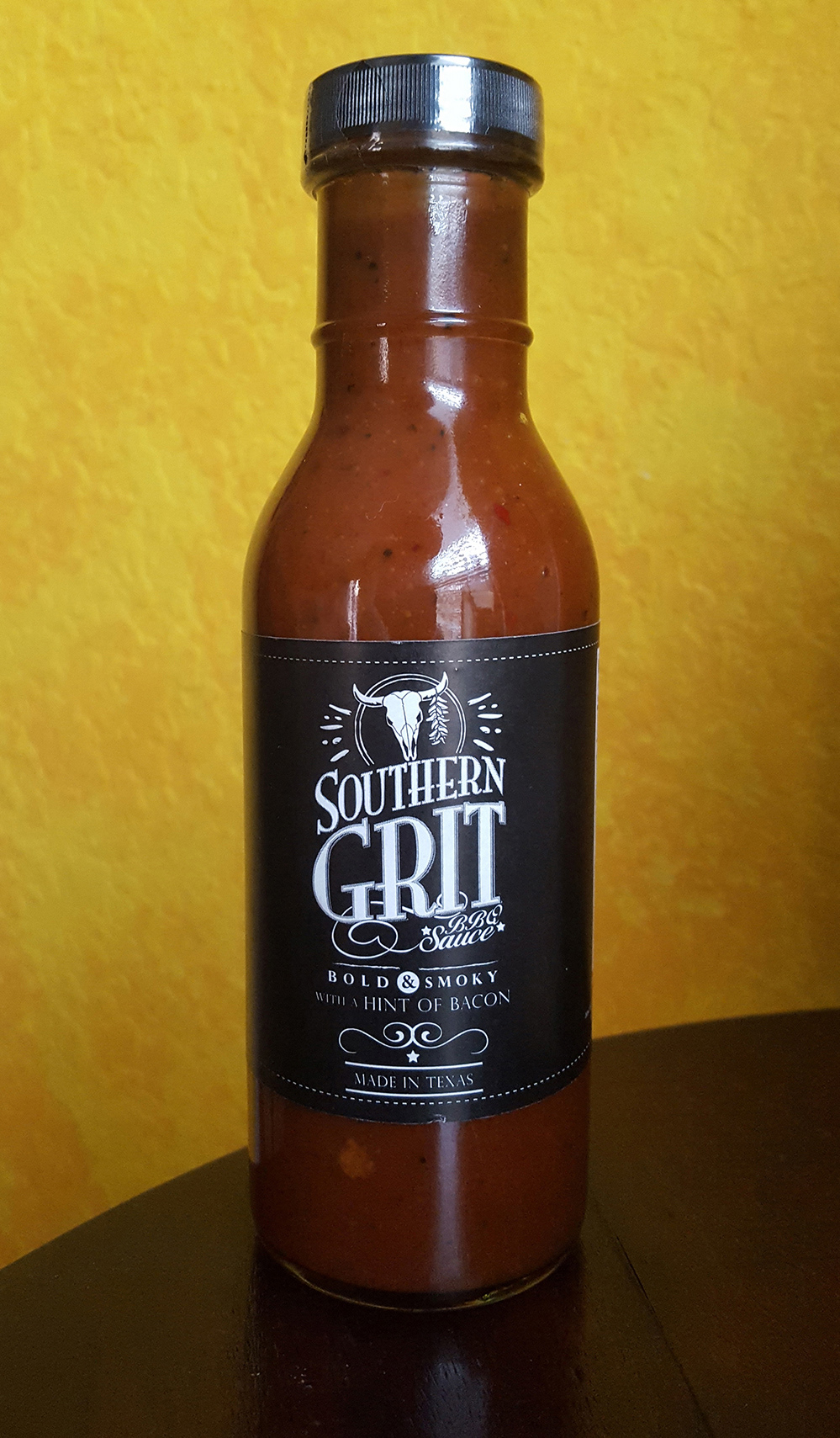
Position | Southern Grit–Freelance Designer
Overview |Designed a BBQ sauce label that captures the bold southern Texas attitude combined with handcrafted authenticity. The label communicates the brand’s personality through strong typography and rustic design elements, helping the product stand out in the market.
Role | Consult, Conceptualize, Design, Lead Proof Reviews, Preflight
Proj. 5
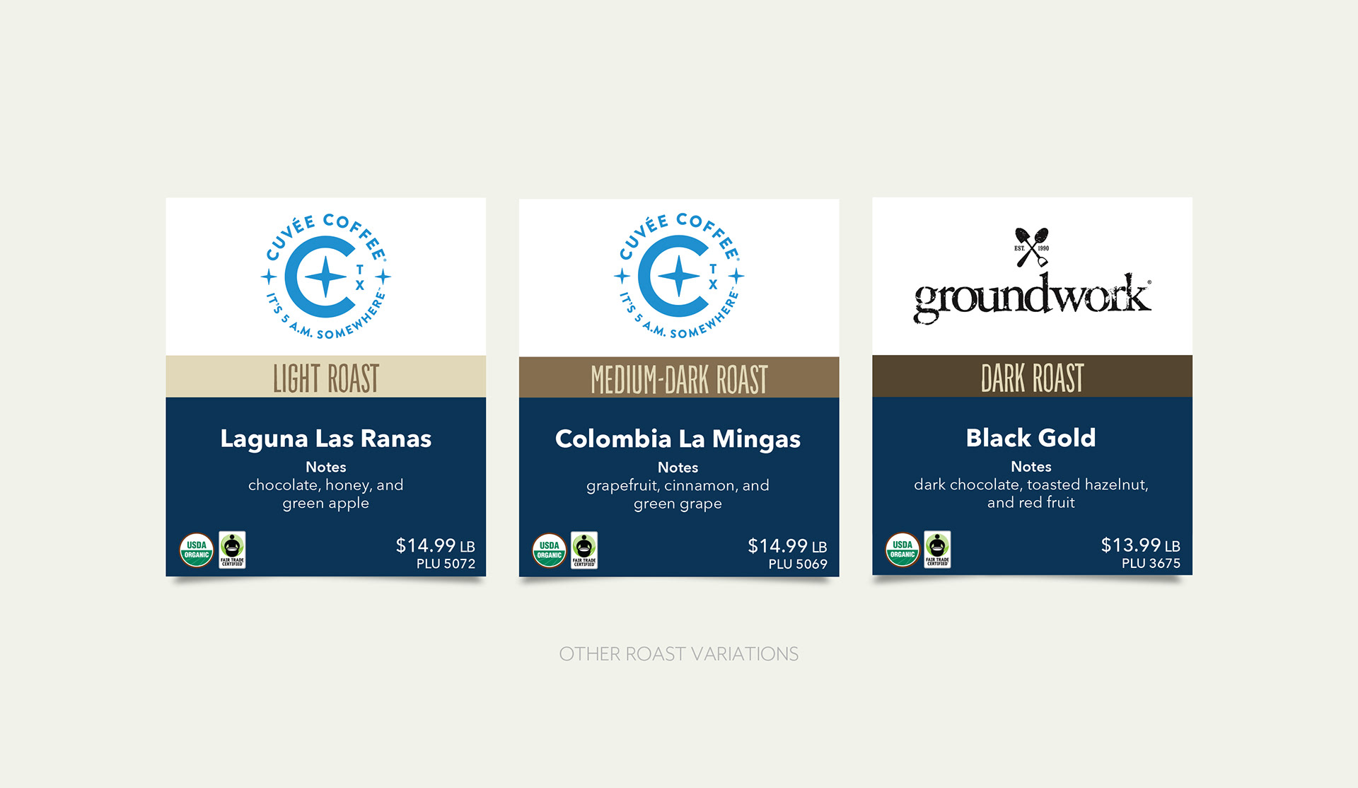
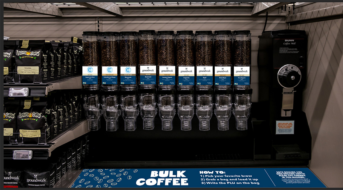
Bulk Coffee
Bulk Coffee
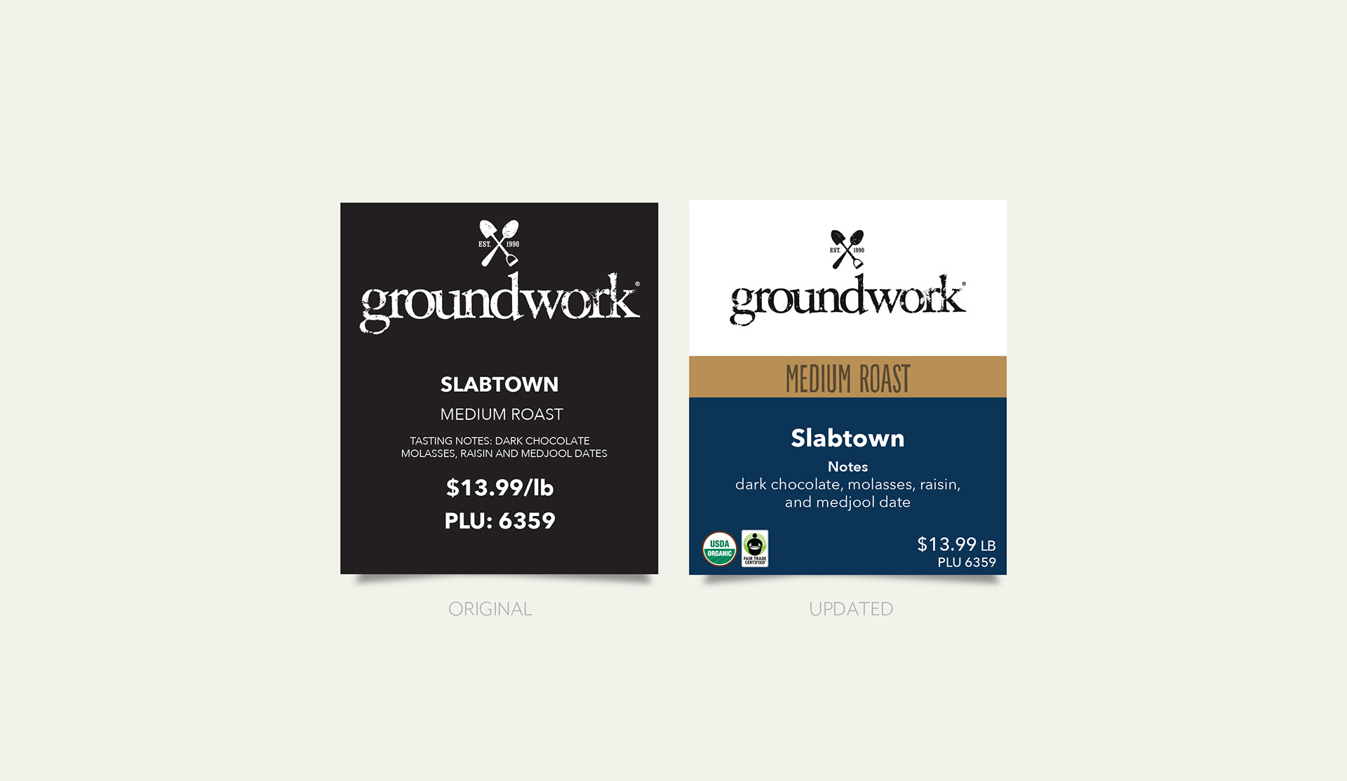
Position | WFM 365–Graphic Designer Lead
Overview | Updated the bulk coffee labels for 365 by Whole Foods Market to ensure consistency with brand standards and simplify product recognition. This redesign brought a unified and polished appearance to the coffee section, making it easier for customers to shop.
Role | Consult, Conceptualize, Design, Lead Proof Reviews, Preflight, and Send to Production